
Choosing Paint Colours for North-Facing Cottage Windows

Why North Light Changes Everything
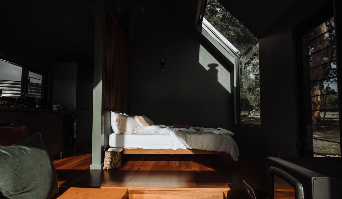
A north-facing window never receives direct sun. What comes through instead is a cool, even, faintly blue-tinged light that barely shifts from morning to late afternoon. In a cottage this steadiness is a real gift: no glare across the kitchen table, no colours flaring and fading as the sun swings round, and a room that looks much the same in March as it does in September. But the same light is unforgiving. Whites read grey. Yellows turn sour and slightly green. Cool greys that looked crisp in a bright showroom go flat and dingy on a lime-plastered wall in January. In a north room the paint has to supply the warmth that the light won't.
The practical rule is simple: choose a colour two or three steps warmer than the one you'd pick for a sunny room. Everything below is about putting that rule to work without ending up with a room that feels like a jar of honey.
Start With a Warm Off-White
Most cottage rooms live or die by their whites. A north wall will quietly drain the life out of a brilliant or blue-based white, so look for off-whites built on a yellow, red or pink base — bone, parchment, almond, old white, stone. These bounce a little warmth back into the room and hold their own on a dull day.
- Avoid anything labelled pure, brilliant or cool white, and anything with a blue or violet undertone.
- Ceilings: pure white overhead in a north room looks grey and heavy. Use a warm white a shade lighter than the walls, and the ceiling will seem to lift.
- Woodwork and skirting: keep it in the same family, either matching the walls or a touch deeper. A crisp bright white against a warm wall only emphasises how cool the light is.
- Resist going too pale. In low light the very palest shades lose definition and the room looks washed out. A little pigment gives the eye something to hold.
Soft Greens, Muted Terracottas and Other Warm Companions
Greens suit cottages and suit north light, provided they lean earthy rather than sharp. Sage, olive, lichen and drab green all carry enough yellow or brown to stay companionable with cool daylight, and they echo the garden pressing up against the window. Steer clear of mint, apple and any green with a blue base — those are the ones that go chilly.
Terracottas are the north room's best friend. Muted clay, dusty brick, soft coral and muted ochre bring warmth without shouting, and they look wonderful in the small, awkward places cottages specialise in.
- Alcoves and chimney breasts — a deeper terracotta or olive makes a feature of a recess that would otherwise sit in gloom.
- Below a dado rail or in a panelled hall — warm tones at waist height catch what light there is.
- Kitchen cupboard doors — a muted green or clay tone is far kinder than white in a north-facing kitchen.
- Window reveals and frames — the deep reveal of a cottage window is a lovely spot for a stronger colour, and it frames the view.
Deep colours can work beautifully in small north rooms, wrapping the space and making it genuinely cosy — but use them where the light is strongest, or in rooms you mostly use after dark. A deep blue or charcoal grey will feel cold unless it has some red or yellow pigment in it.
Test on Large Paper, Over Several Days
Small patches of colour are worse than useless. Paint two coats onto sheets of lining paper at least A3, ideally A2, and leave a couple of centimetres of bare paper around the edge so your eye has something neutral to compare against. Let them dry completely — wet paint is darker and shinier than the finished surface — then move them around the room.
- Check each sheet in the morning, at midday, at dusk, and again with the lamps on.
- Look at it vertically, propped or fixed to the wall, never flat on a table.
- Try it beside the window reveal and in the darkest corner; the same colour can look like two different paints.
- Compare two or three at a time at most. Six samples together tell you nothing.
- Live with your favourite for a week before you buy a full tin, and don't commit until you've seen it at dusk in winter.
Account for What's Already in the Room
No cottage room is a blank canvas. Dark beams soak up light and throw a warm brown reflection back onto the walls, which can push a green towards grey. Flagstones, brick and wide floorboards add their own warmth from below. Old pine doors and waxed furniture do the same. If you already have a lot of warm timber, you can afford a slightly cooler green — but in a north room, keep it a warm green anyway.
Artificial light matters just as much. Warm bulbs around 2700K, spread across several lamps rather than one central fitting, will flatter these colours. Cool white LEDs will undo everything you've just spent three weekends getting right.
Finishes, Breathability and Keeping the Palette Tight
Many cottage walls are lime plaster, which needs to breathe. Limewash, clay paint and distemper are the traditional choices, and they behave differently from modern emulsion: the finish is chalky, translucent and shifts through the day, and it often dries lighter or patchier than the sample pot suggests. Allow for that. On the whole, a soft matt or chalky finish is ideal for old, uneven walls, while a low-sheen eggshell on woodwork gives you something you can wipe down.
Finally, don't choose each room in isolation. Three or four colours across the ground floor, with the lightest reserved for the darkest rooms and one accent — a terracotta, a soft olive — carried through on doors, cupboards or a single chimney breast, will make a small cottage feel considered rather than chopped up. North light rewards restraint and warmth. Give it both and those quiet rooms become the ones everyone gravitates to.

Joeby Ragpa
This template is so awesome. I didn’t expect so many features inside. E-commerce pages are very useful, you can launch your online store in few seconds. I will rate 5 stars.
ReplyAlexander Samokhin
This template is so awesome. I didn’t expect so many features inside. E-commerce pages are very useful, you can launch your online store in few seconds. I will rate 5 stars.
ReplyChris Root
This template is so awesome. I didn’t expect so many features inside. E-commerce pages are very useful, you can launch your online store in few seconds. I will rate 5 stars.
Reply