
Using natural textures in a neutral cottage scheme

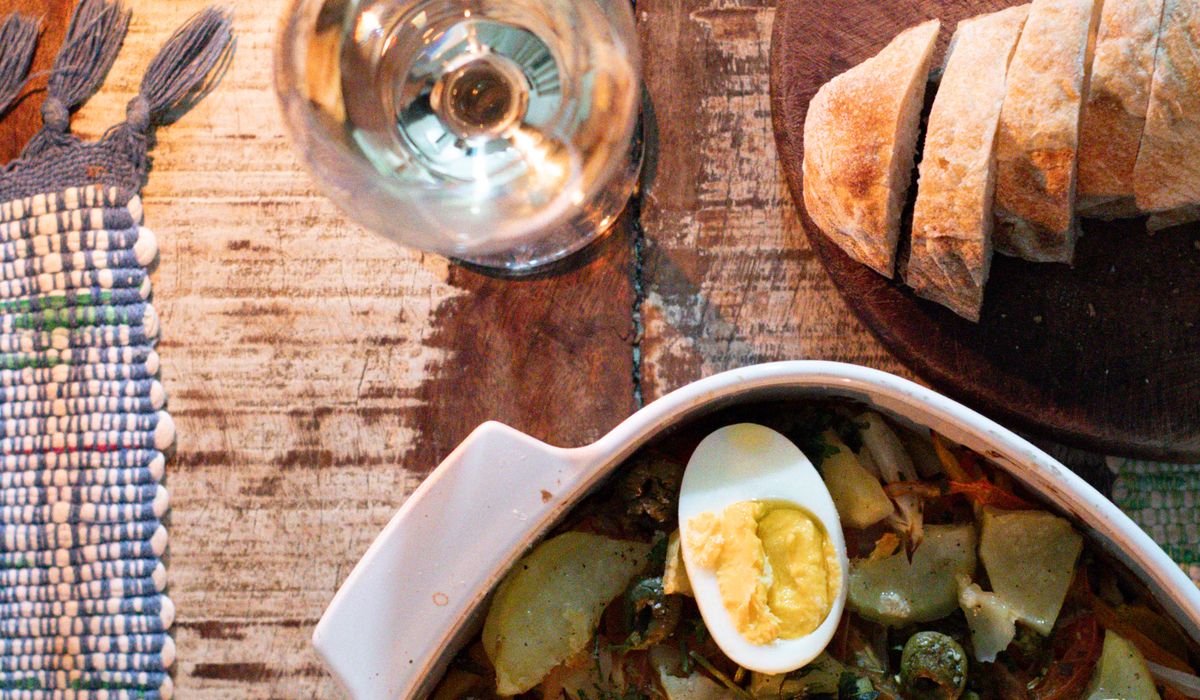
Why a neutral scheme needs texture before it needs colour
Pale rooms are forgiving. They flatter small windows, low ceilings and the general wonkiness of an old cottage, and they give you a calm backdrop that never fights with the view. But paint four surfaces in the same chalky off-white and something odd happens: the room goes flat. It reads less like a considered scheme and more like a blank page waiting for instructions.
The fix is rarely more colour. It is texture. A neutral palette works when the eye has something to travel across — a slubby linen cushion, a basket with a rough weave, a scrubbed oak beam, a lime-washed wall that shifts from cream to grey as the light moves. Texture is what stops a quiet room feeling empty, and it does the job without asking you to commit to a single bold colour decision.
Start with wool and linen, the backbone of the cottage look
If you only make one change, make it at the window and on the sofa. Wool and linen are the two workhorses of a neutral cottage interior, and they behave very differently in the same room. Linen creases, drapes and softens with washing; wool holds its shape, traps warmth and adds a dull, dense weight that stops a scheme feeling thin.
- Curtains: look for a heavyweight linen or a linen-cotton mix rather than a flimsy sheer. Anything under about 200gsm will look apologetic at a draughty window. Interlined curtains in a wool blend are worth the extra cost in a cold room.
- Throws: an undyed wool or lambswool throw over the arm of a chair adds instant depth. Chunky, hand-knitted textures read beautifully against smooth plaster.
- Cushions: mix at least three textures in the same tonal family — a fine linen, a bouclé or looped wool, and something with a visible weave such as a herringbone.
- Floor: a flat-weave wool rug in oatmeal or undyed grey does more for a pale room than any amount of patterned carpet.
Keep to two or three tones — bone, oatmeal, mushroom — and let the difference in surface do the talking instead of the difference in shade.
Rattan, cane and willow: texture with air in it
Natural fibres that hold their shape give a neutral room structure without weight. Rattan, cane, willow and seagrass all cast fine shadows and introduce a slightly honeyed warmth that stops a cool white scheme going clinical.
Use them where you would otherwise reach for something shiny or synthetic. A willow log basket beside an inglenook, a cane armchair in a bedroom corner, a seagrass rug over flagstones, a set of woven storage baskets on an open shelf. Second-hand pieces are usually better made than new ones and often cheaper — auctions, house clearances and charity shops in market towns are full of them.
One caution: baskets and cane can look dusty and tired very quickly in a working cottage. Give them a brush with a soft dry brush every few weeks rather than a wet cloth, which raises the grain and can leave water marks.
Aged wood and honest surfaces
New pine is the enemy of a neutral scheme. It is too pale, too uniform and too orange once it yellows. What you want is wood that has already done some living: oak with a mottled patina, elm with visible grain, a scrubbed kitchen table with knife marks in it.
- Leave structural timber bare where you can — beams, lintels, a stripped door — and wax rather than varnish. A soft beeswax finish keeps the surface matte and touchable.
- Introduce one or two large wooden pieces rather than many small ones. A single long bench or a hefty dresser base anchors a room in a way that six little accessories never will.
- Mix species deliberately. Oak, elm and ash in the same room read as collected rather than matched, which suits an old building.
- If a piece is too orange, a thin wash of pale lime or a diluted chalky paint wiped back will calm it without hiding the grain.
Walls, floors and hard finishes that repay a close look
Texture is not only soft furnishings. The surfaces themselves can carry a great deal of interest, and this is where a cottage can be pushed gently away from the flat and towards the interesting.
Lime plaster and limewash give a chalky, slightly uneven finish that changes with the daylight — perfect for old walls that were never straight. Clay paints offer a similar softness with a matt, breathable finish that suits solid stone walls where modern vinyl emulsion can trap damp. On the floor, unglazed terracotta, tumbled limestone and reclaimed brick all bring warmth and a slight irregularity that factory-finished tiles cannot imitate.
If a full change of surface is out of reach, remember the smaller moves: a rough stone hearth, a slate splashback, a hand-thrown ceramic bowl on a plain shelf, a battered metal bucket by the fire. Each one adds a note.
Layering without turning a calm room into clutter
The temptation once you start noticing texture is to overdo it. A neutral room needs contrast, not competition, so work in order of scale: floors first, then walls, then the largest piece of furniture, then the window, and only then the small things.
A simple test is to squint at the room. If you can still tell where the soft surfaces, the hard surfaces and the woven surfaces are, the balance is right. If everything blurs into one grey-beige mass, add one more textural layer. If it looks busy, remove the smallest item and step back.
Finally, accept that natural materials need maintenance and that this is part of their charm. Wool wants airing, linen wants washing, wood wants wax, cane wants dusting. A neutral cottage scheme is not a low-effort look — it is a quiet one, and the richness comes from the fact that every surface has been noticed, chosen and looked after.

Joeby Ragpa
This template is so awesome. I didn’t expect so many features inside. E-commerce pages are very useful, you can launch your online store in few seconds. I will rate 5 stars.
ReplyAlexander Samokhin
This template is so awesome. I didn’t expect so many features inside. E-commerce pages are very useful, you can launch your online store in few seconds. I will rate 5 stars.
ReplyChris Root
This template is so awesome. I didn’t expect so many features inside. E-commerce pages are very useful, you can launch your online store in few seconds. I will rate 5 stars.
Reply